

In the past year the Calex team did not sit still. In addition to the launch of five newcollections and a number of stylish additions to last year’s collections, they have also seen time to give all packaging a new look!
Consistency
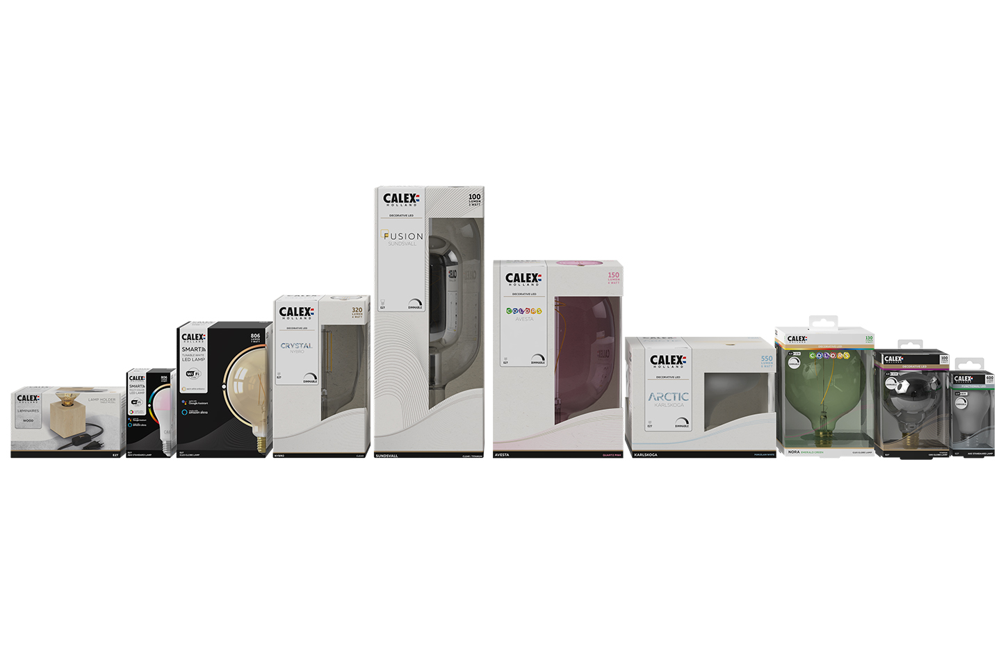
Over time, Calex has created recognizable packaging for all products. This year it was time to merge all designs and create a portfolio that is consistent with the new direction of Calex. For example, a recognizable and clear wordmark has been added, a playful wave has been developed to replace the familiar globe and all icons have received a mini makeover. All components are used consistently for all series and categories. Calex store shelves have never looked so good!
PET packaging
If we say everything has been given a makeover, we mean everything. In addition to the sizable decorative series, the transparent PET packaging also has a new design. Somewhat different about these packages is the color coding. This has been added to help our consumers choose the right lamp for the purpose of use. The gold line is for the decorative series and silver for the functional series. Each series has its own subtle color banner to easily distinguish between the series.